

gear up
gear up
Design & Art Direction
Wireframing
Prototyping & Testing
UX/UI Design
Design Systems
Interaction Design
Identity Design
brand guidelines
Design & Art Direction
Wireframing
Prototyping & Testing
UX/UI Design
Design Systems
Interaction Design
Identity Design
brand guidelines
gear up
Design & Art Direction
Wireframing
Prototyping & Testing
UX/UI Design
Design Systems
Interaction Design
Identity Design
brand guidelines
approach
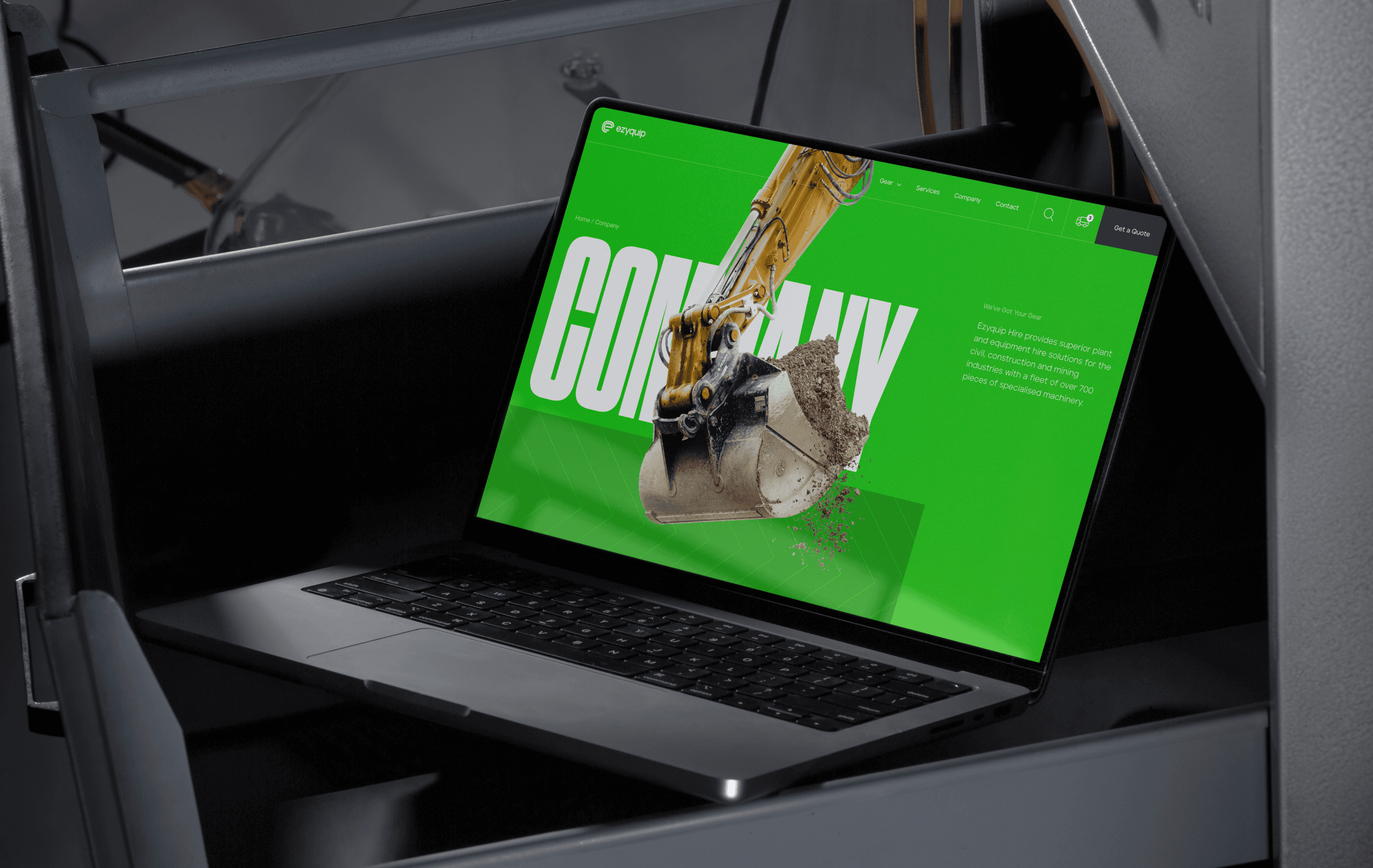
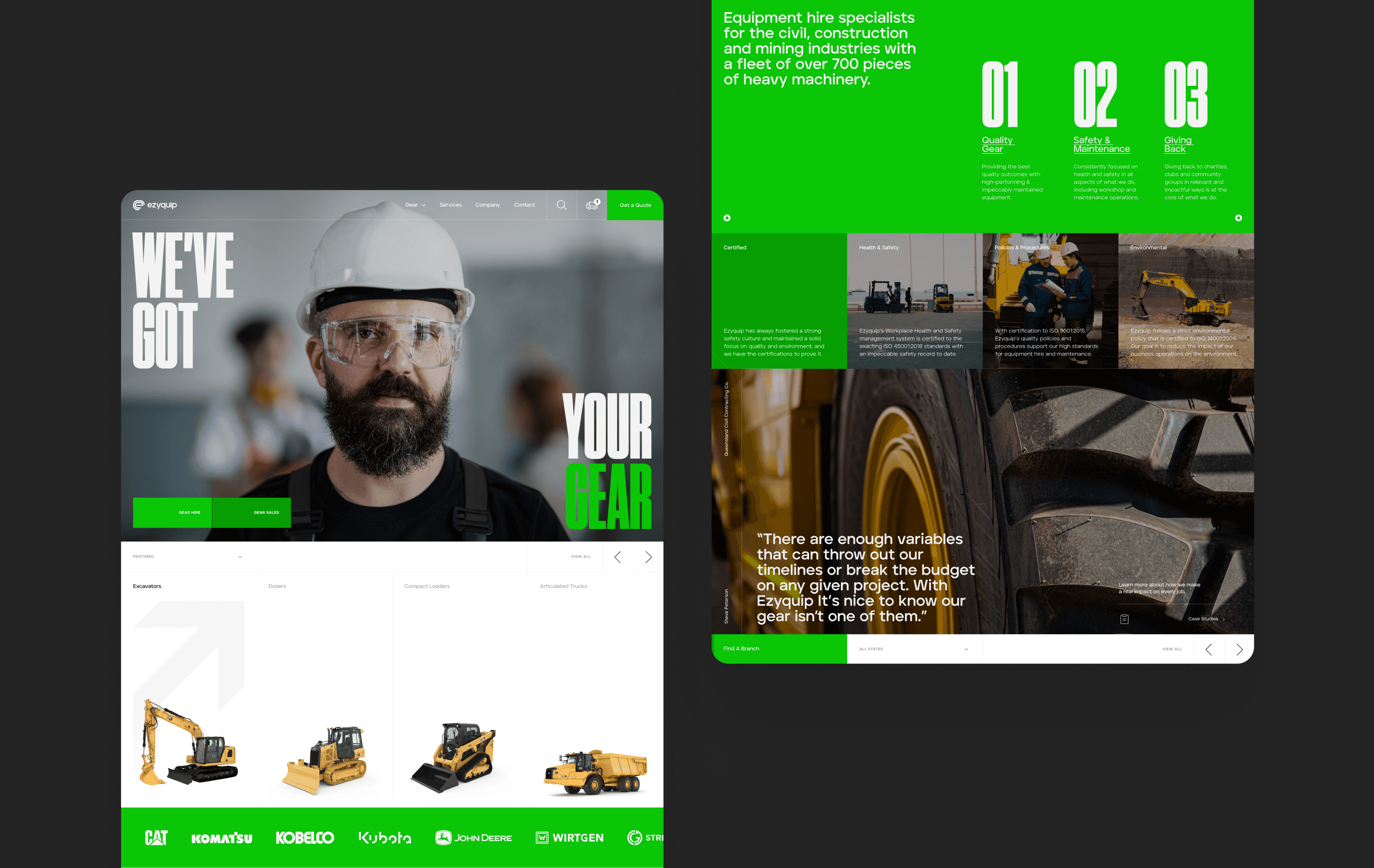
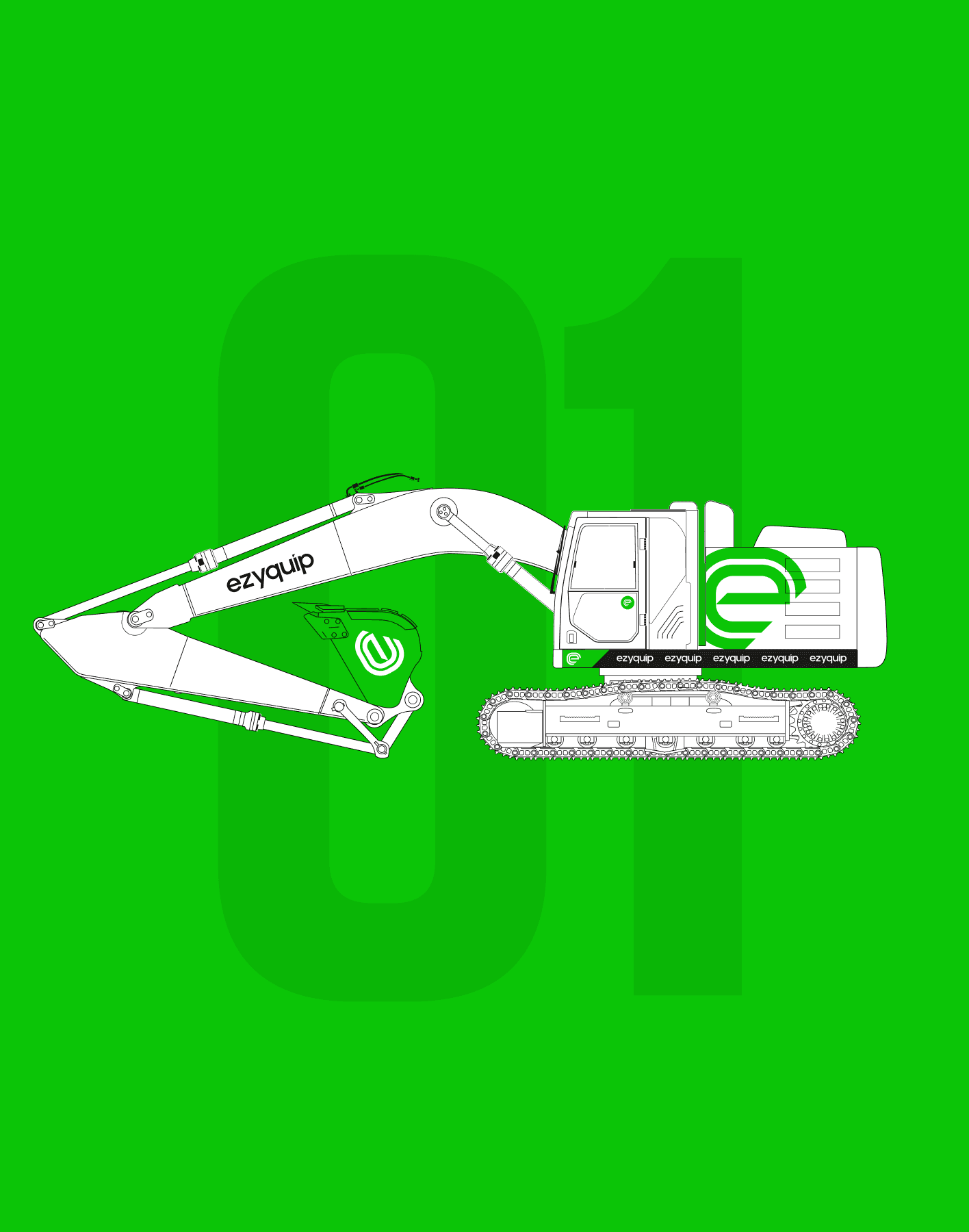
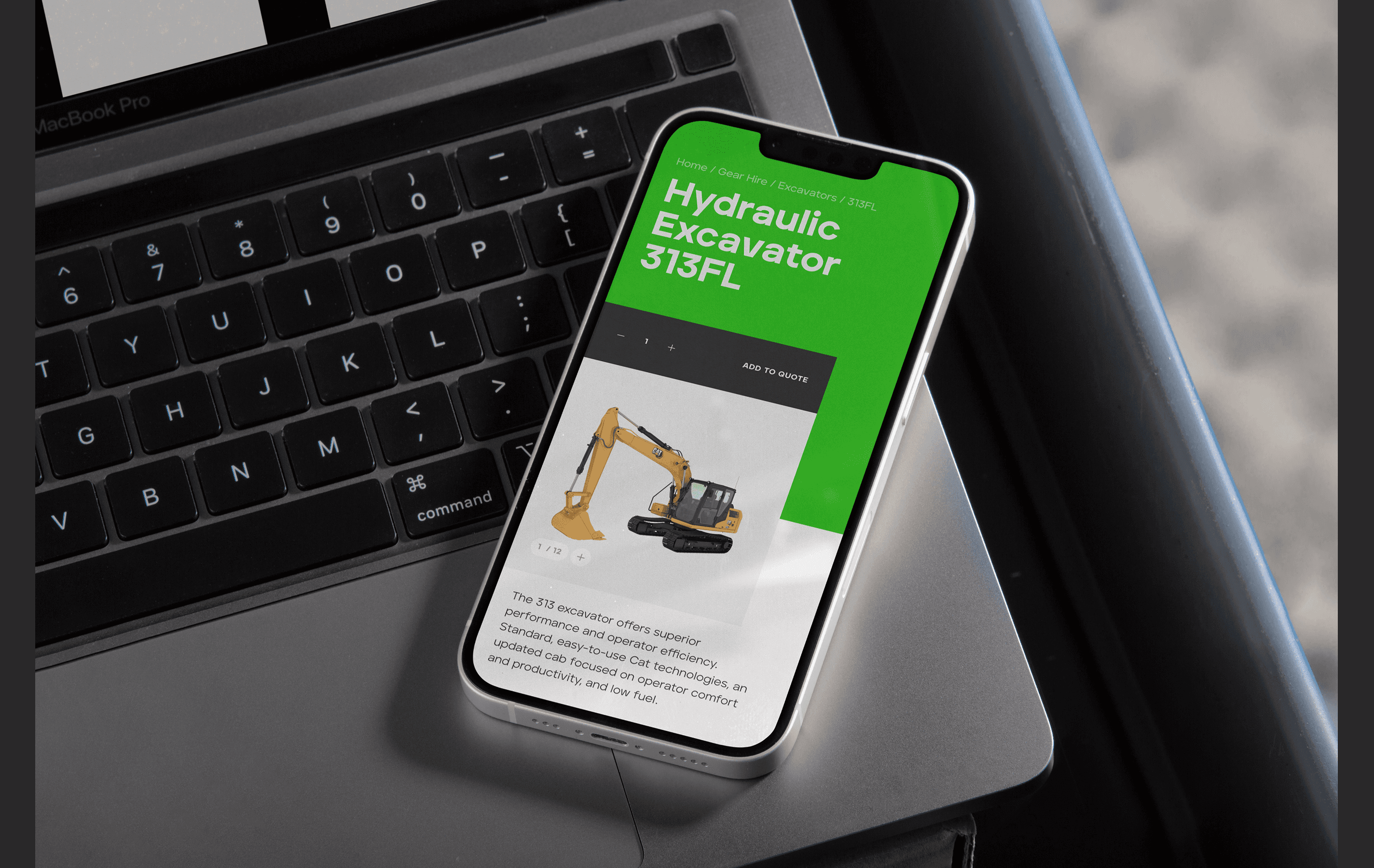
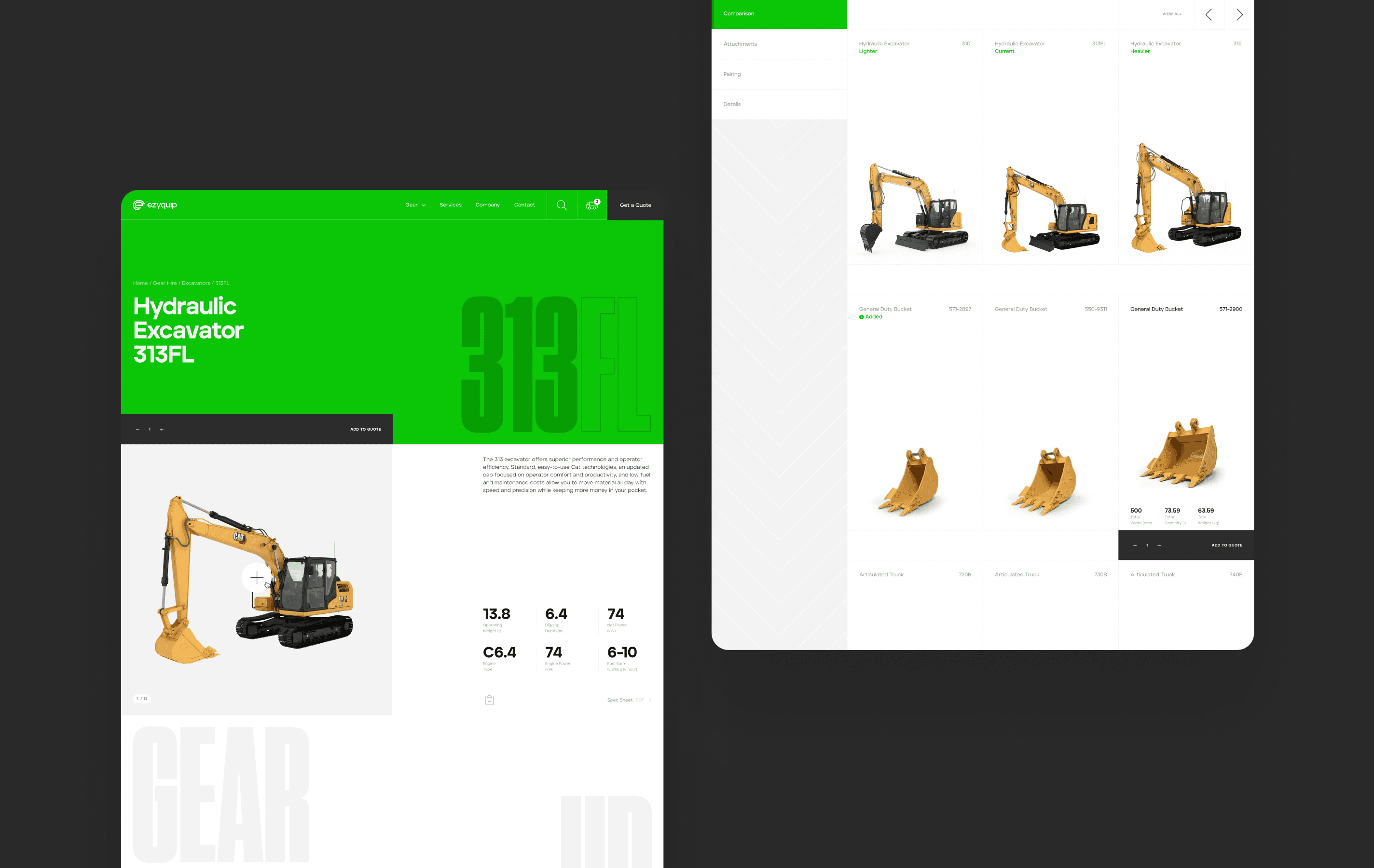
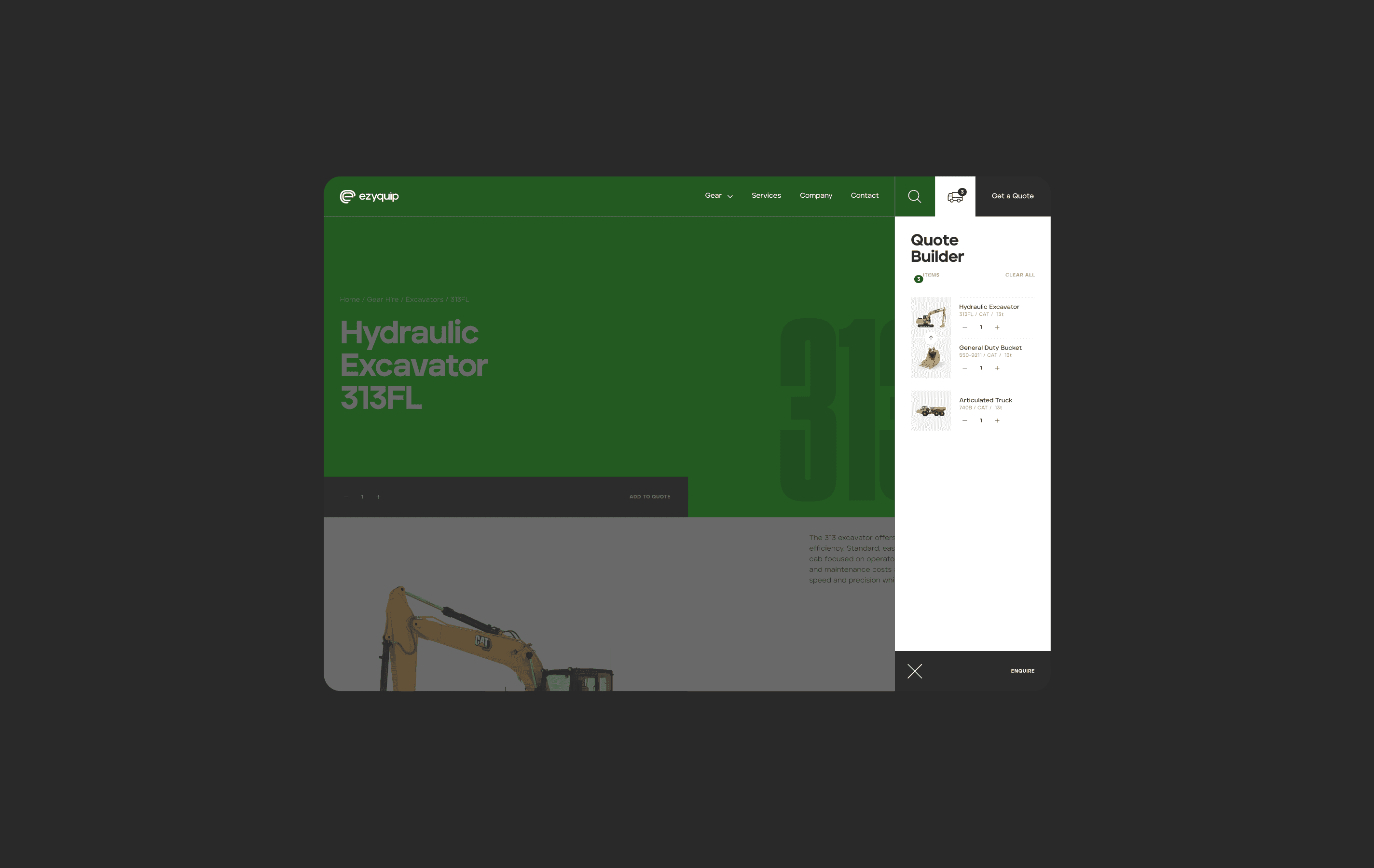
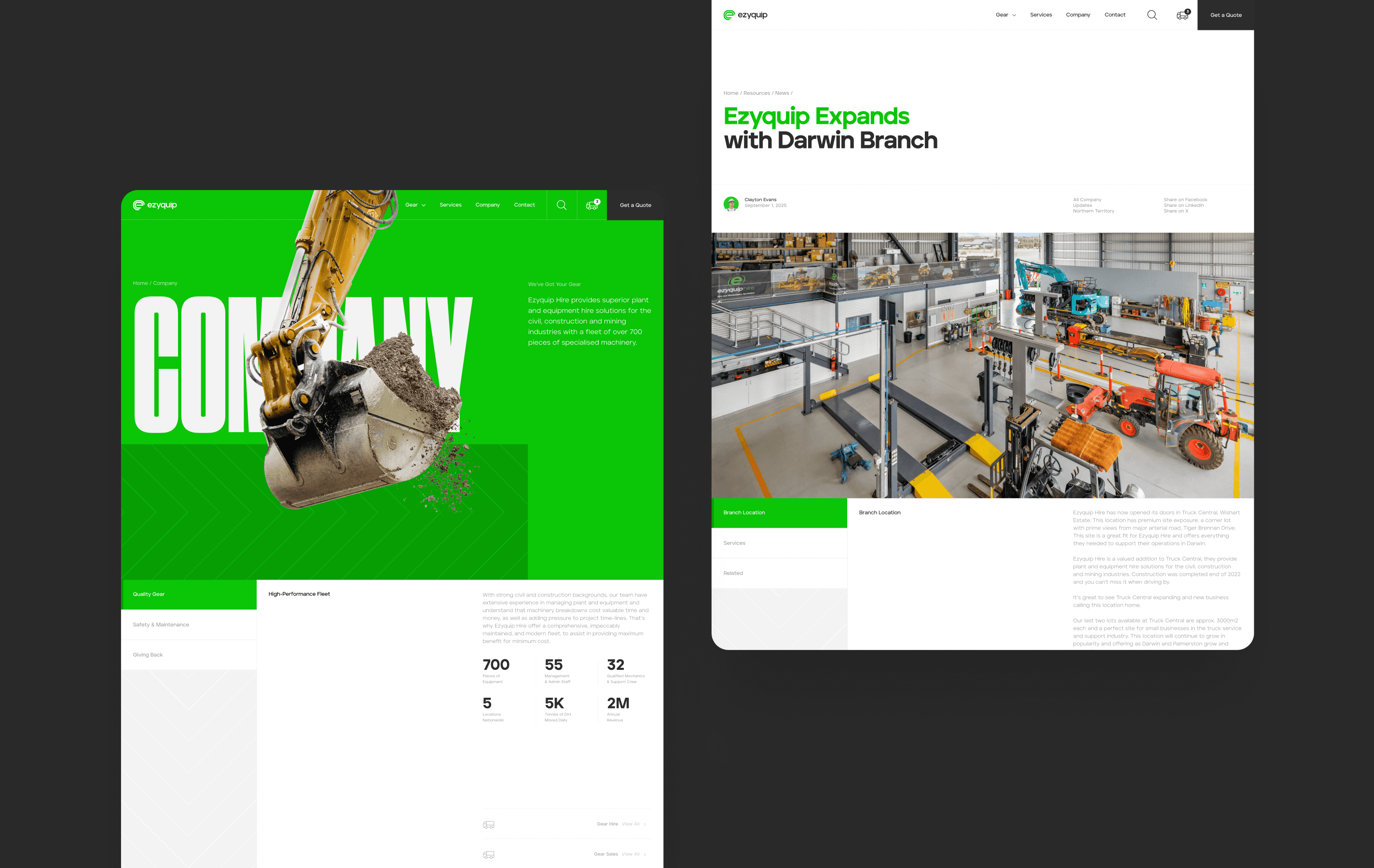
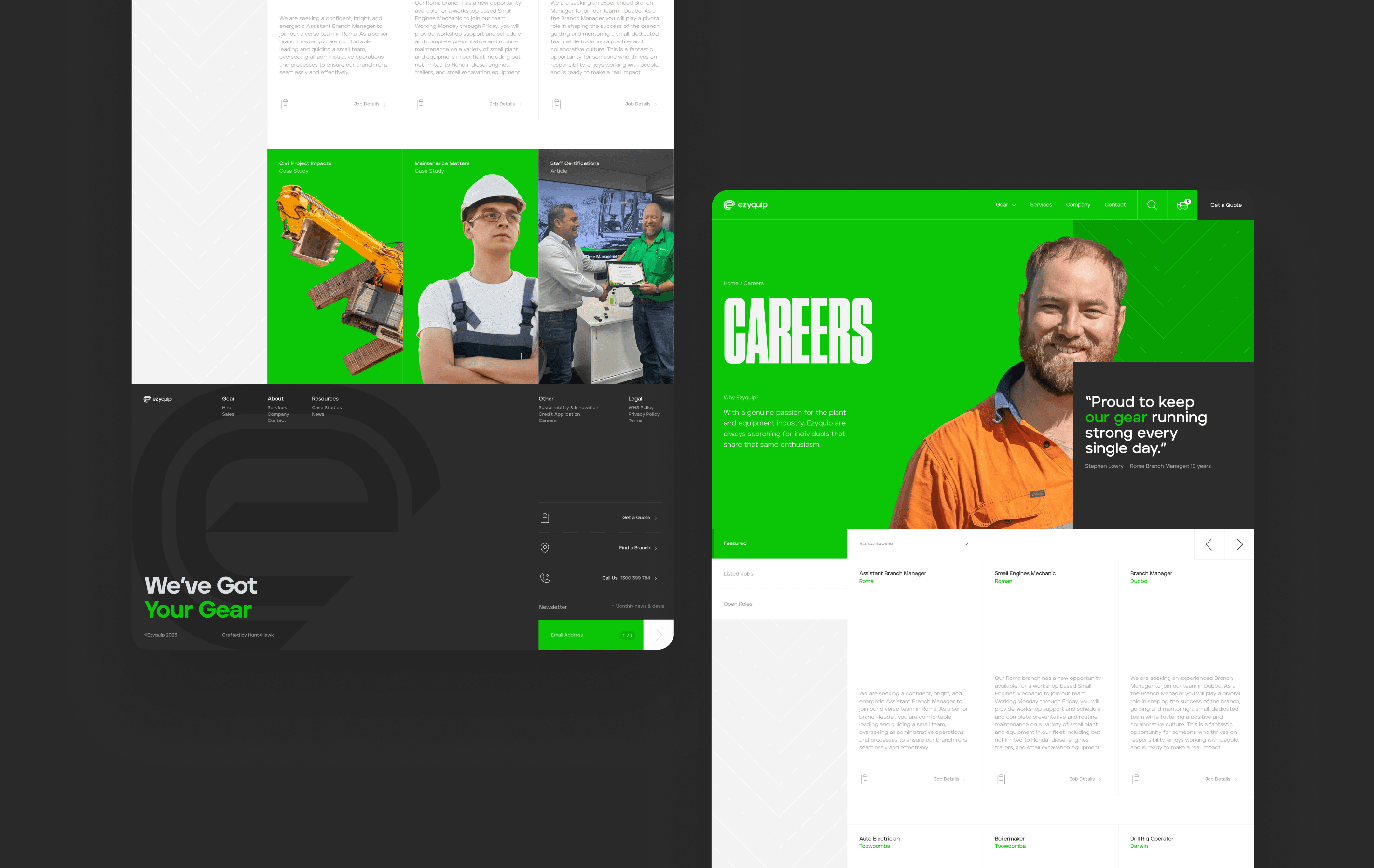
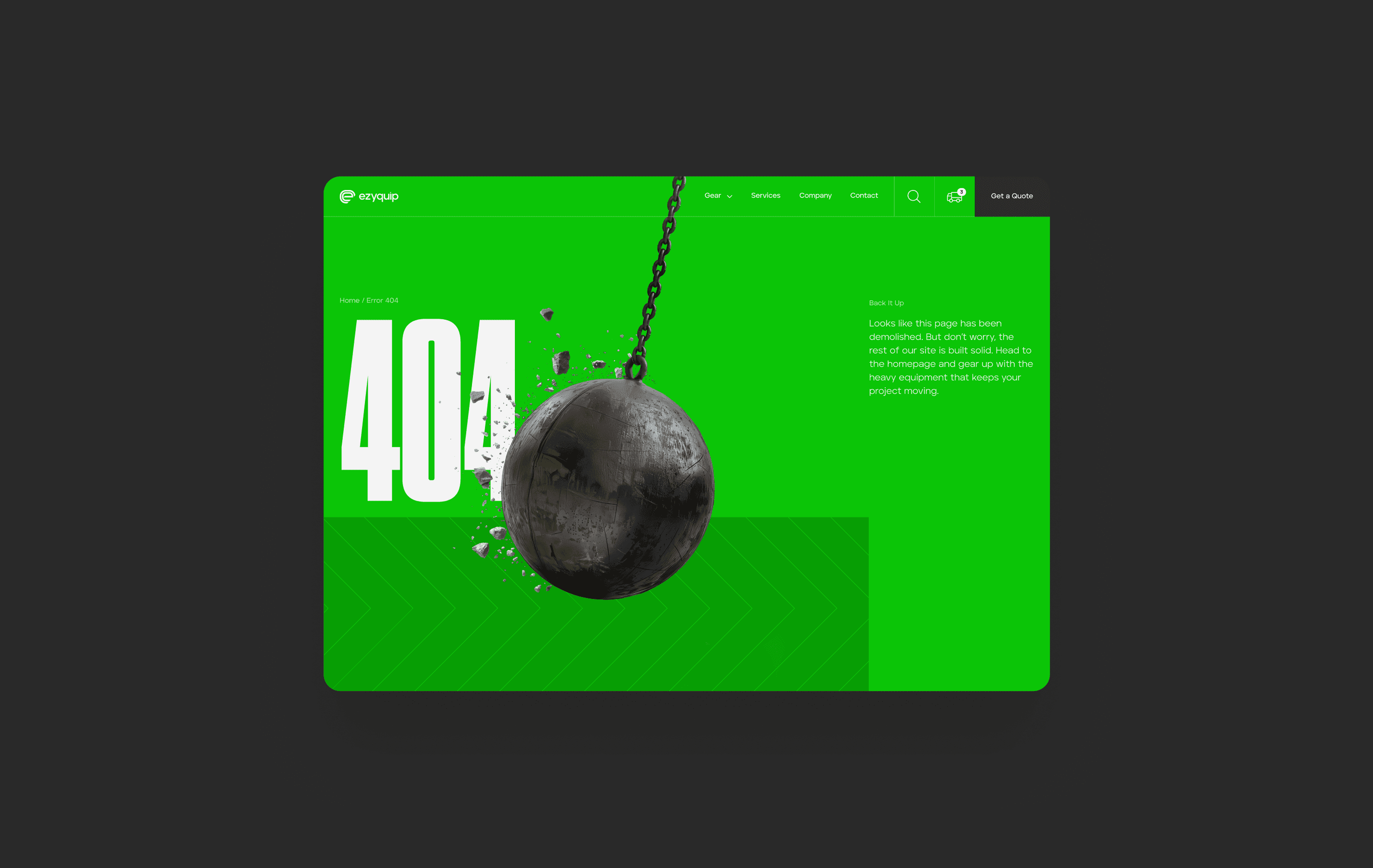
Eazyquip had outgrown its regional origins, and the brand needed to look and operate like a national leader in the heavy equipment hire space. The new identity evolves the existing mark with stronger, engineered forms: the dual-line logo nodding to heavy machinery tracks, backed by a more vibrant green for modernisation without losing recognition. Typography is bold, industrial and built for the sector. The website UX was rebuilt around how customers actually search for equipment. Categories and navigation were simplified, hiring allowing users to find the right gear faster and with less friction. A clean, modular design system gives the brand the visual authority it previously lacked and elevates the hiring experience.
Eazyquip had outgrown its regional origins, and the brand needed to look and operate like a national leader in the heavy equipment hire space. The new identity evolves the existing mark with stronger, engineered forms: the dual-line logo nodding to heavy machinery tracks, backed by a more vibrant green for modernisation without losing recognition. Typography is bold, industrial and built for the sector. The website UX was rebuilt around how customers actually search for equipment. Categories and navigation were simplified, hiring allowing users to find the right gear faster and with less friction. A clean, modular design system gives the brand the visual authority it previously lacked and elevates the hiring experience.
approach
Eazyquip had outgrown its regional origins, and the brand needed to look and operate like a national leader in the heavy equipment hire space. The new identity evolves the existing mark with stronger, engineered forms: the dual-line logo nodding to heavy machinery tracks, backed by a more vibrant green for modernisation without losing recognition. Typography is bold, industrial and built for the sector. The website UX was rebuilt around how customers actually search for equipment. Categories and navigation were simplified, hiring allowing users to find the right gear faster and with less friction. A clean, modular design system gives the brand the visual authority it previously lacked and elevates the hiring experience.


OUTCOMES
While the new brand and website are still preparing for launch, internal and customer testing has already shown a clear shift in perception. Stakeholders and long-term clients now see the business presented with the authority, professionalism, and national presence it has earned. The new hire flow has reduced confusion, clarified equipment paths, and demonstrated faster discovery in testing stages, early signs of stronger commercial performance once live.
While the new brand and website are still preparing for launch, internal and customer testing has already shown a clear shift in perception. Stakeholders and long-term clients now see the business presented with the authority, professionalism, and national presence it has earned. The new hire flow has reduced confusion, clarified equipment paths, and demonstrated faster discovery in testing stages, early signs of stronger commercial performance once live.
While the new brand and website are still preparing for launch, internal and customer testing has already shown a clear shift in perception. Stakeholders and long-term clients now see the business presented with the authority, professionalism, and national presence it has earned. The new hire flow has reduced confusion, clarified equipment paths, and demonstrated faster discovery in testing stages, early signs of stronger commercial performance once live.
" height="609.981721021999px" id="ONwDcDcuT" width="1423.9999713323368px"/></svg>)
