
change
change
Design & Art Direction
Wireframing
Prototyping & Testing
UX/UI Design
Design Systems
Interaction Design
Identity Design
brand guidelines
Generative AI Prompting
Design & Art Direction
Wireframing
Prototyping & Testing
UX/UI Design
Design Systems
Interaction Design
Identity Design
brand guidelines
Generative AI Prompting
change
Design & Art Direction
Wireframing
Prototyping & Testing
UX/UI Design
Design Systems
Interaction Design
Identity Design
brand guidelines
Generative AI Prompting
approach
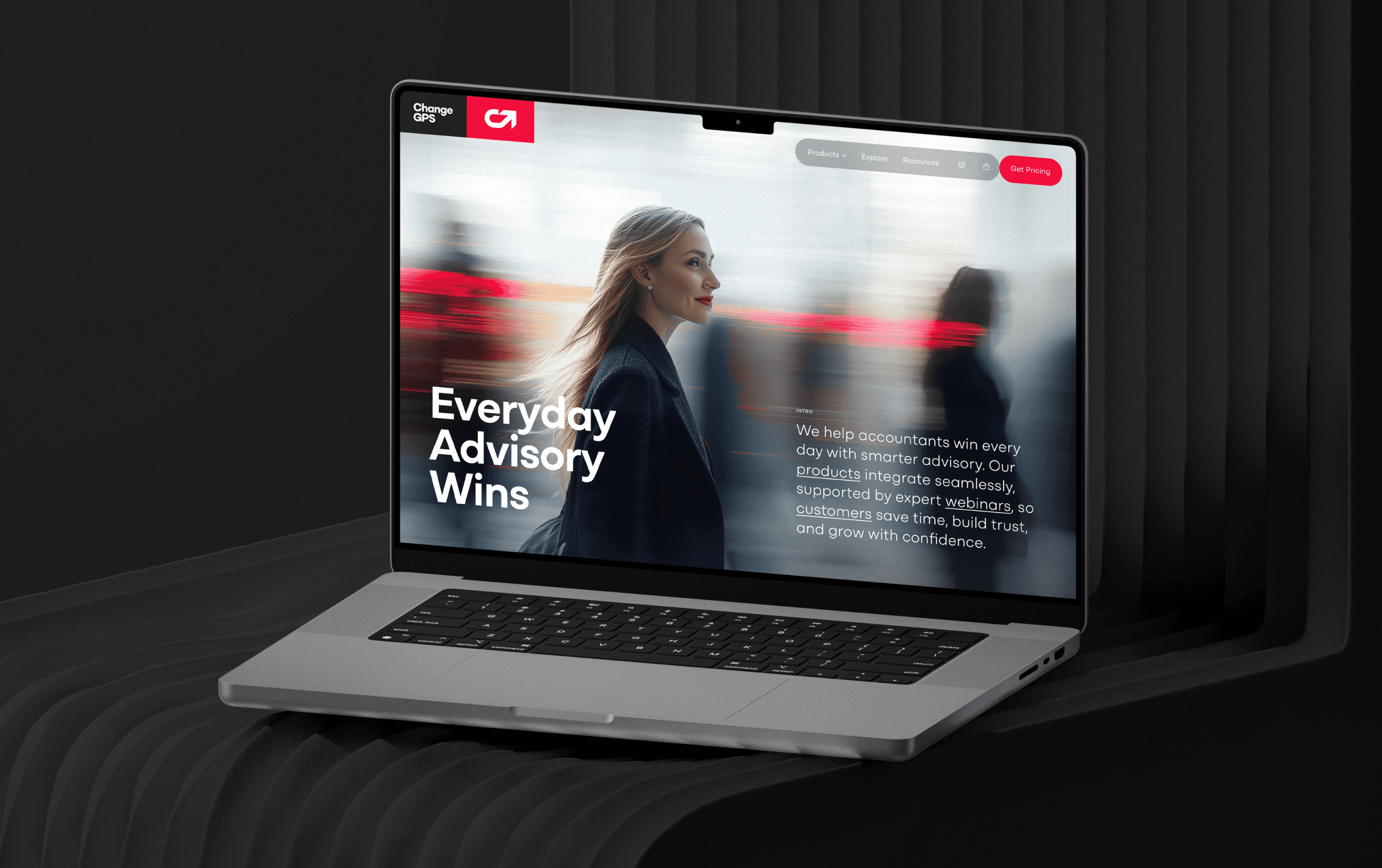
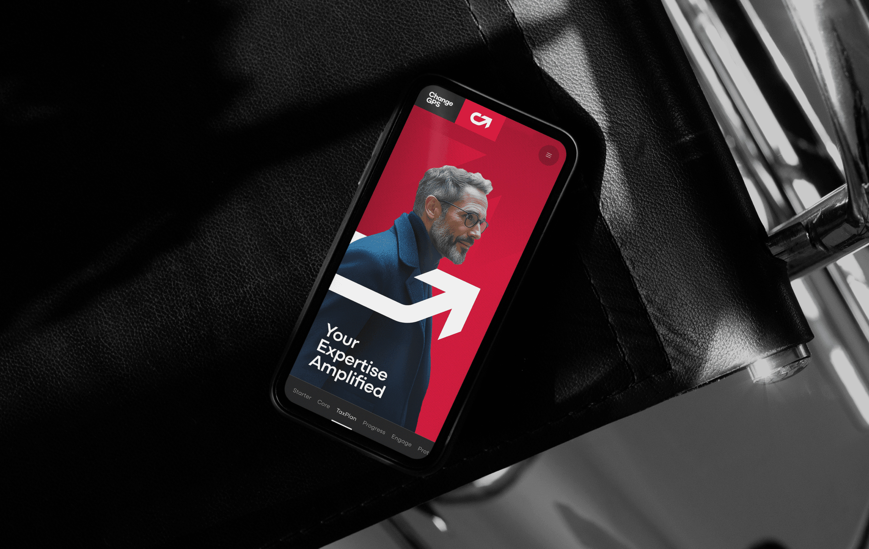
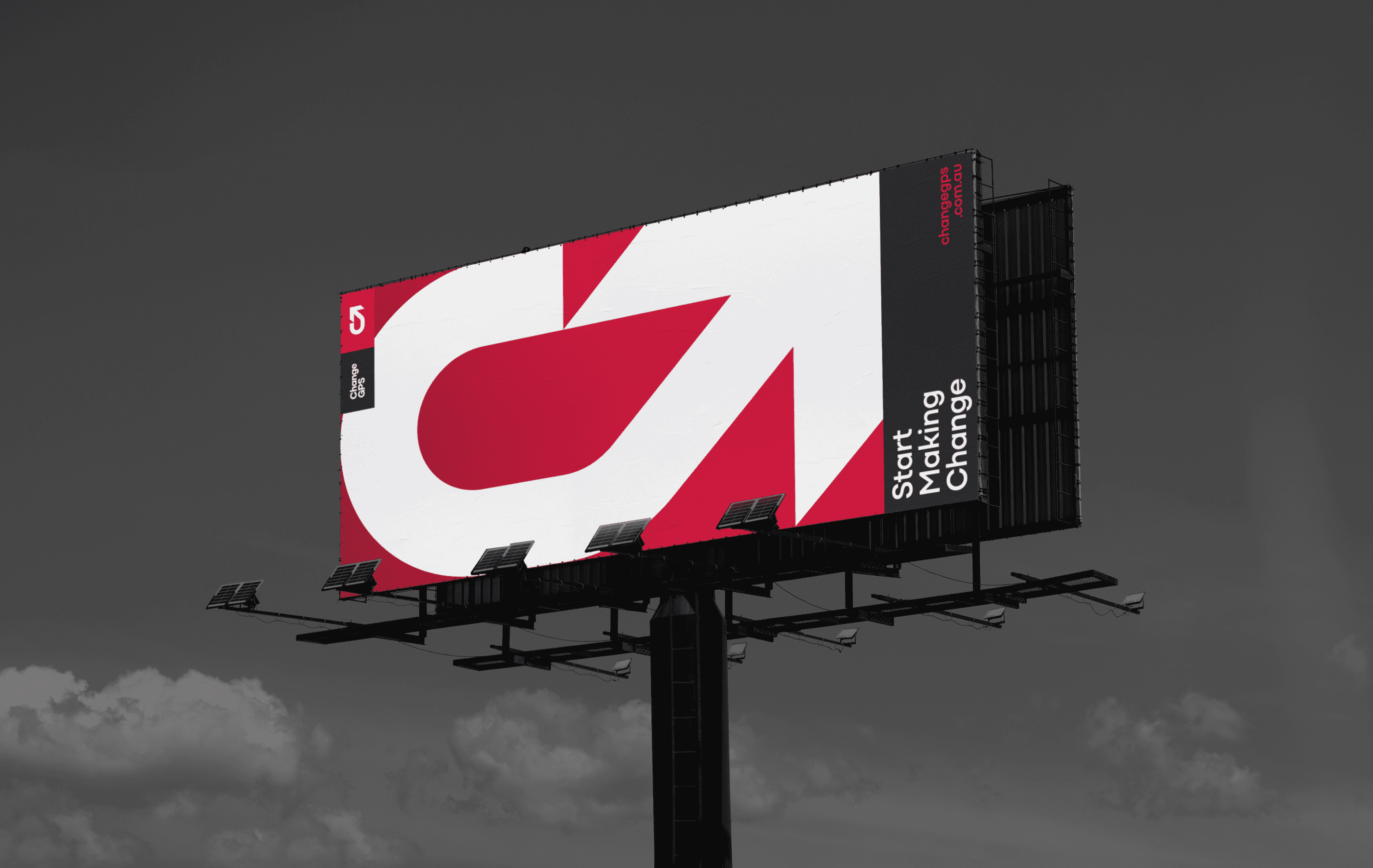
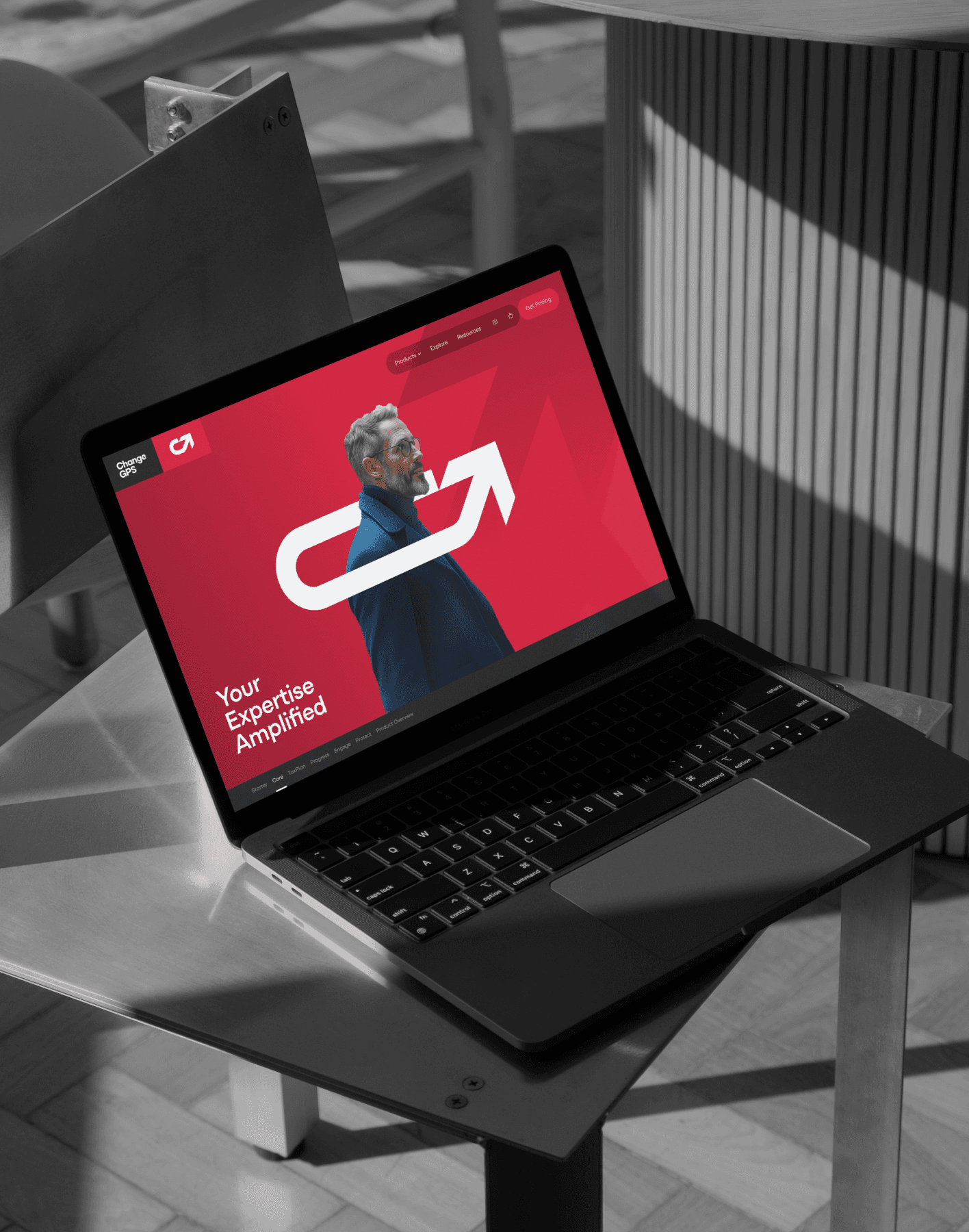
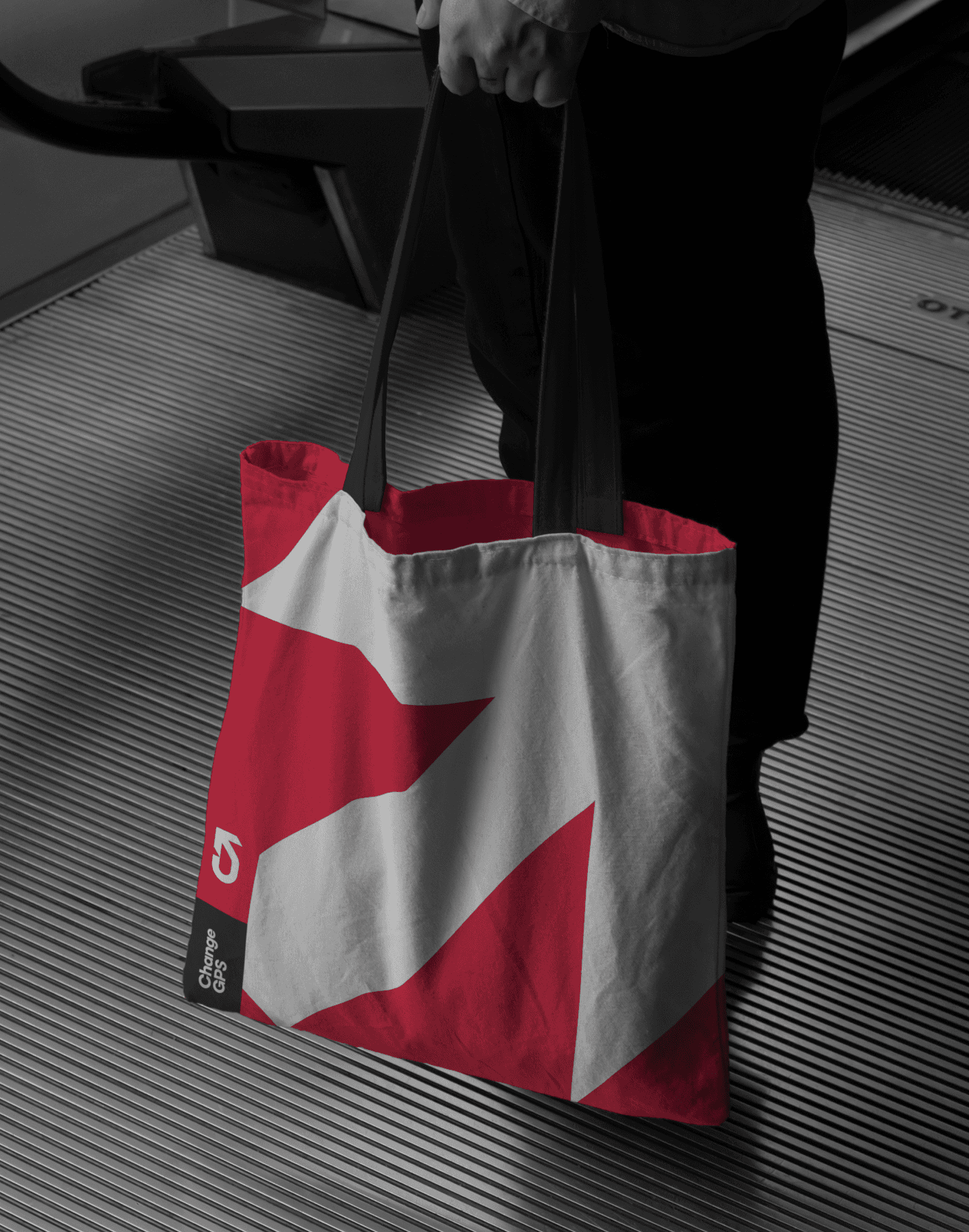
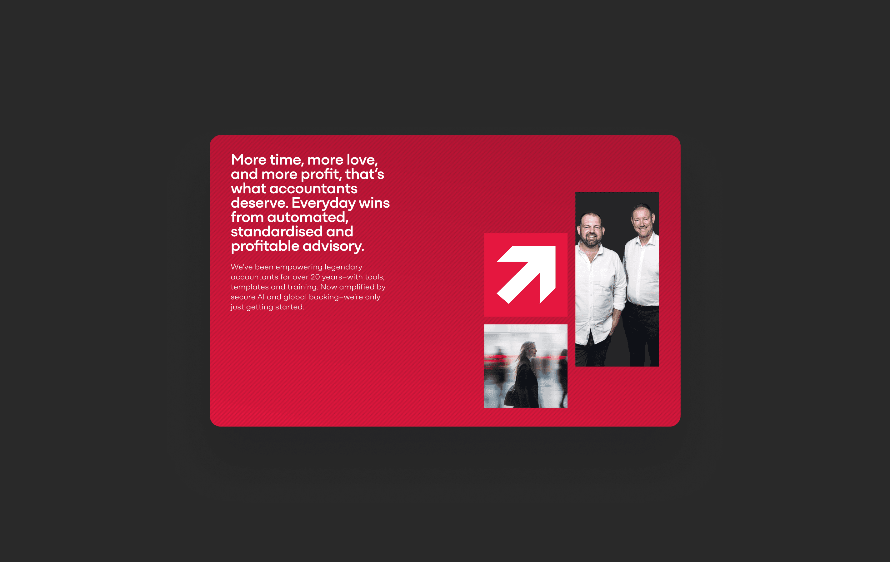
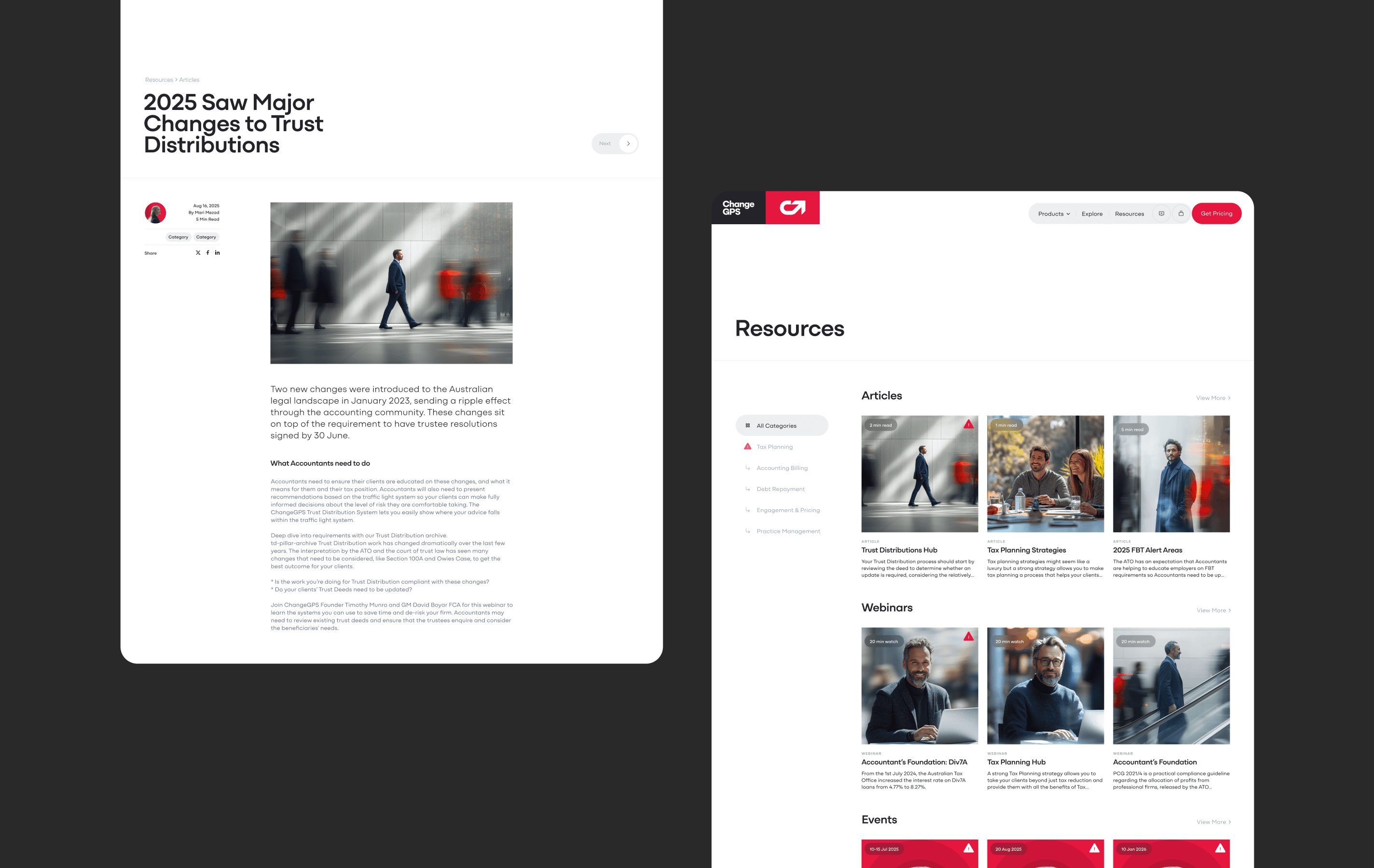
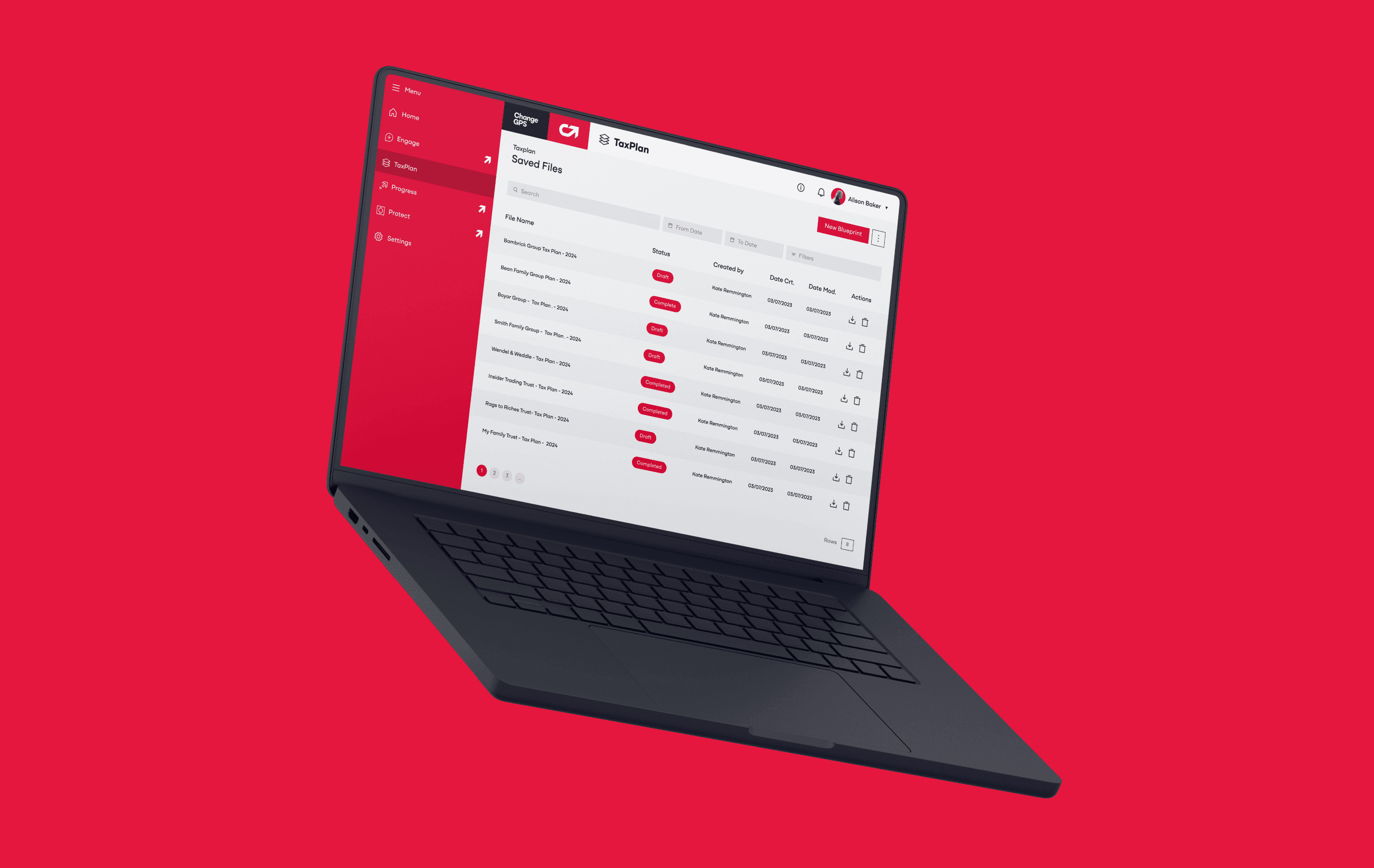
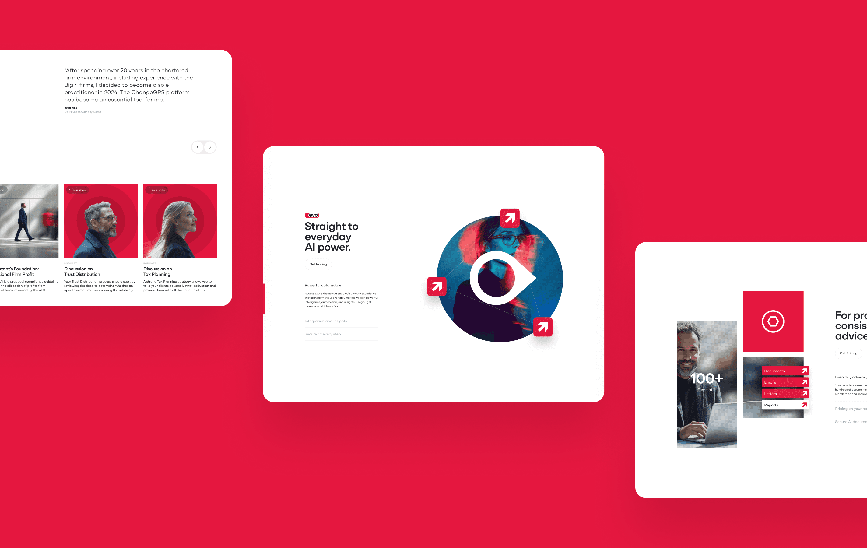
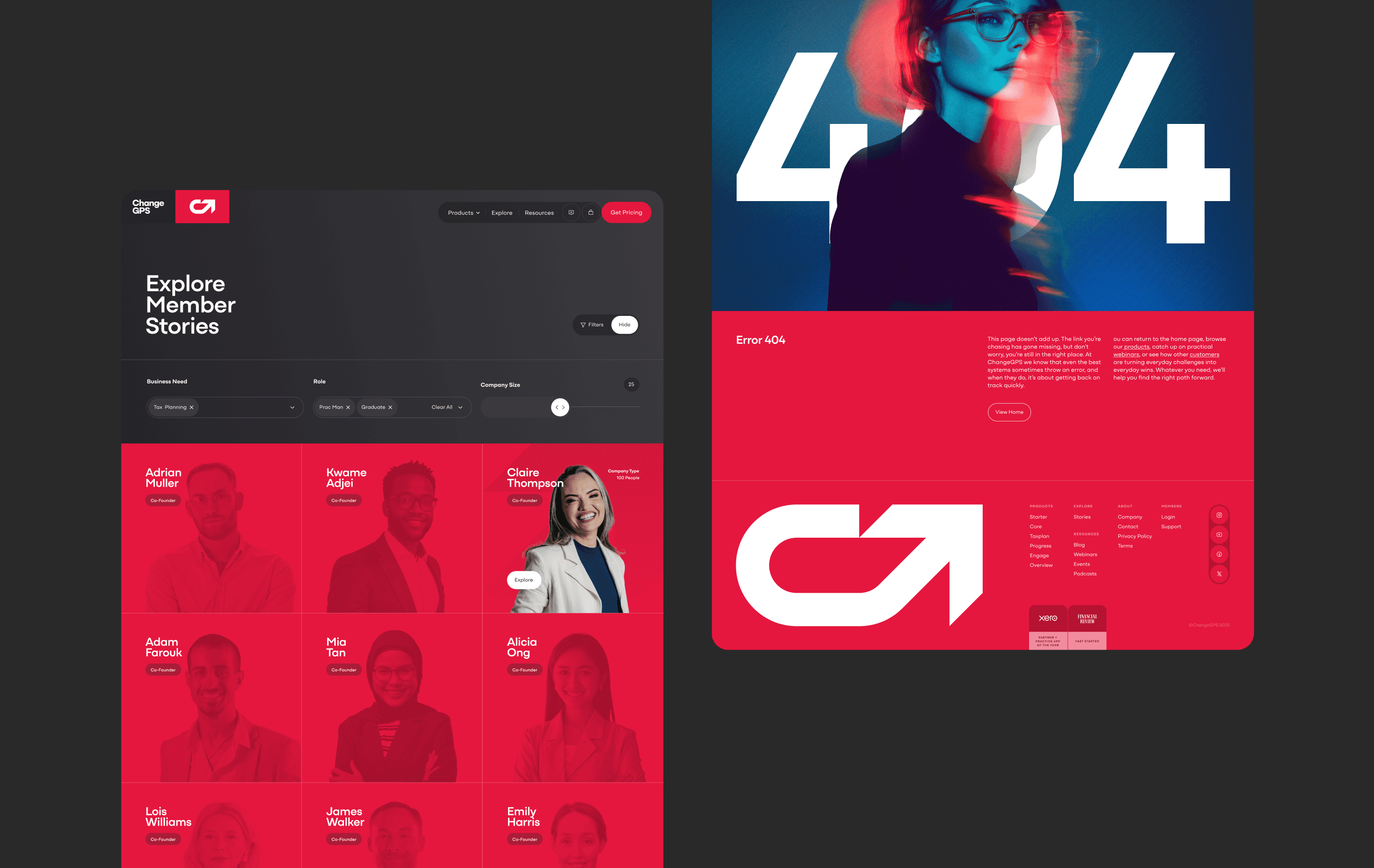
The brand needed to feel contemporary, confident and technically forward, reflecting a platform now powered by AI and built to accelerate growth for accountants. A bold new identity centred on upward momentum was created, expressed through a geometric mark that combines a “C” with a rising 45° arrow. Red became a strategic differentiator in a sea of green competitors, while AI-generated imagery replaced traditional photography to create a cohesive visual world. The digital experience simplified a complex offering into a cleaner, more intuitive product journey.
The brand needed to feel contemporary, confident and technically forward, reflecting a platform now powered by AI and built to accelerate growth for accountants. A bold new identity centred on upward momentum was created, expressed through a geometric mark that combines a “C” with a rising 45° arrow. Red became a strategic differentiator in a sea of green competitors, while AI-generated imagery replaced traditional photography to create a cohesive visual world. The digital experience simplified a complex offering into a cleaner, more intuitive product journey.
approach
The brand needed to feel contemporary, confident and technically forward, reflecting a platform now powered by AI and built to accelerate growth for accountants. A bold new identity centred on upward momentum was created, expressed through a geometric mark that combines a “C” with a rising 45° arrow. Red became a strategic differentiator in a sea of green competitors, while AI-generated imagery replaced traditional photography to create a cohesive visual world. The digital experience simplified a complex offering into a cleaner, more intuitive product journey.


OUTCOMES
The refreshed brand and website delivered a more confident market presence, clearer product understanding, and a stronger reflection of the platform’s evolved capabilities. Engagement improved post-launch, with early performance supporting better acquisition and retention.
The refreshed brand and website delivered a more confident market presence, clearer product understanding, and a stronger reflection of the platform’s evolved capabilities. Engagement improved post-launch, with early performance supporting better acquisition and retention.
The refreshed brand and website delivered a more confident market presence, clearer product understanding, and a stronger reflection of the platform’s evolved capabilities. Engagement improved post-launch, with early performance supporting better acquisition and retention.
29
29
increase in website conversions (%)
increase in website conversions (%)
18
18
reduction in churn across the first six months (%)
reduction in churn across the first six months (%)
" height="609.981721021999px" id="ONwDcDcuT" width="1423.9999713323368px"/></svg>)
